BASE
A shooting range becomes an academy for personal safety

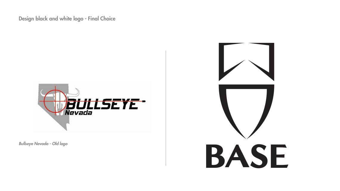
Base, formerly known as Bullseye Nevada, is a Nevada-based security training center and adventure outfit. They sought to rebrand to better reflect their comprehensive range of services beyond just being a shooting range.
Challenge
Base faced several challenges in their rebranding journey:
- Overcoming the perception of being solely a shooting range
- Appealing to a broader, more diverse user demographic
- Communicating their expanded range of services and competencies
- Establishing a brand that resonates with civilians, security contractors, transitioning military members, and law enforcement professionals
Our mission, that we chose to accept, was to create a powerful new brand identity that embodied Base’s mission to provide comprehensive education in the personal security marketplace.

Unveiling the Shield of Expertise
Through a collaborative insight exercises, we distilled Base’s brand essence to three key pillars:
- Security, Strength, and Expertise.
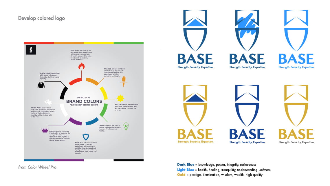
This process informed our creation of a bold new visual identity, featuring a shield symbol and strong typography that appeals to Base’s wider demographic.
The comprehensive rebranding positions Base as a multifaceted security education provider, embodying their commitment to offering individuals ownership with knowledge, skills, and confidence in personal security across various professional contexts.

