Brand identity for a survival, tactical, and security training center.
Base
Offerings
- Brand Evaluation
- Competitive Analysis
- Brand Strategy
- Brand Messaging
- Logo & Visual Design
Challenge
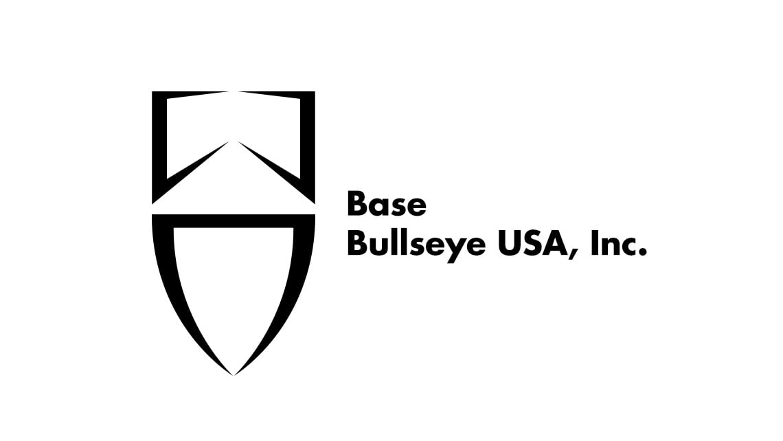
The purpose of this project was to rebrand a Nevada-based security training center and adventure outfit with a mission to provide education in the personal security marketplace for civilians, security contractors, military members transitioning to civilian security roles and law enforcement professionals. Formerly known as Bullseye Nevada, the organization was perceived as a shooting range. Their new name, Base, reflects their broader range of services and competencies.
Solution
Due to the new and much broader user demographic for Base, we implemented a co-creation process to gather insights to understand this demographic and to empathize with their unique experiences. This resulted in identifying the brand’s core values, mission and position and a brand essence of: Security, Strength, Expertise. With this fresh direction we used the symbol of a shield and a bold, mid-weight font emphasizing these three points and appealing to their wider demographic.
Base
Brand identity for a survival, tactical, and security training center.
More of our work